Digitising autonomous colours poses a range of challenges (“chromatic callier-effect”1, autonomous colours falling outside scanner spectral sensitivities2, etc.). There is no perfect solution or equipment to overcome these challenges though. Every institution has to come up with a solution based on educated guesses and the equipment available - Settle on something pragmatic and document what you do!
In my case, the available equipment is the DFT Scanity (and the MWA Nova Spinner). My educated guesses and typical workflow is based around my knowledge of this scanner’s behaviour. Due to the aforementioned scanner sensor sensitivity issues, I know that some autonomous colours will not be captured in a representative manner.
In this particular use case I had a tinted feature film, with several tints I knew the Scanity would have trouble capturing. The usual workflow here would be to scan the nitrate print and do grading, while having the nitrate close by for reference. However, a challenge here was that the material would be scanned, and post-processed much later (if at all). Remembering how it looked is not an option, and writing down something like “cyan” is not precise enough.
The film in question is also a six reel feature film, with a multitude of different tints, so grading would most likely take a while.
I decided to see if I could find a way to create good reference photos of all the tints from all the reels, during my preparation inspection of the reels. My goal was to create reference photos that were good enough to be used for reference in the grading process, so that I would not have to retrieve the nitrate materials from the vault again.
Creating reference images
After some thinking I landed on an approach that was 1. easy to set up, and 2. did not require any equipment I did not already have available.
Equipment needed:
- Light box (Kaiser slimite plano LED)
- Camera with manual settings (Panasonic G9)
- Macro lens/macro ring (Laowa 50mm f/2.8 2X Ultra Macro APO)
- Friction arm/tripod
- A trusted monitor
First of all you need a reliable light source. High CRI and known colour temperature is a plus. I’ve been using a Kaiser slimite plano table, which is easily obtained, affordable and supposed to be 95CRI. You get what you pay for though. My Kaiser has a slight flicker and the given colour temperature (while consistent) is only in the ballpark of the given 5000K. Mine seems to be around 5300K.
Camera-wise, I reckon you can use anything you have available that can be set to manual settings. I used a macro lens on a Panasonic G9 camera.
For settings I used aperture priority, the lowest ISO that still allowed me to capture sharp images. With a non-flickering light source I would have used fully manual settings. However, to compensate for the slight variations in luminance from the Kaiser light box, I ended up using spot metering set on the white light source (not the film). If you do metering on the actual film strip, you will get unwanted variations.
Use remote shutter or delay on the shutter, to keep the shots sharp (even though that’s not really a prerequisite for judging colour).
Review the results on a monitor you trust, until you know how close you will get to the source. I reviewed the photos on the calibrated monitor of my MacBook pro m1, set to rec709 colourspace.
I also applied a simple and consistent contrast change to my photos, to compensate to some degree for the diffuse light source. Before using the photos I applied a white point adjustment to D65, for grading in rec709. You need to pay some attention to colour spaces here!

Camera and tripod setup
Results
Working like this produced good results, with reference images that very accurately reproduced the colours of the film as I saw them on the light box.
There are some limitations here of course and probably a lot of pitfalls I’m not even aware of. For example I am using a diffuse light source which can result in colour shifts. Projected contrast is also left to guesswork.
However, without a collimated light source I will just have to accept these limitations. I still assume the reference image represent the colours much more accurately than our scanners capture them.
Another thing to note here is that, while the colours might not be 100% accurate, this enables you to document the colours in relation to each other. Eg. “tint X” is greener than “tint Y”. Documenting that yellow 1 has redder mid-tones/shadows than yellow 2 for example is valuable information.

Two different yellows
As long as you are aware of the limitations of what you are doing, I think this is a valid approach for documenting film colours - at least in the short term for grading help.
For assessment controls of film material you could also work like this to produce photo documentation very easily. For example of documentation of damages to the film.
For the film in question I took around 100 reference images like this.

Typical reference image
If I were to do this for other film material more routinely, I would do some changes to my approach:
- I would use the camera tethered to a computer, so that I could use remotely trigger the shutter, adjust focus better, do reviews of the images’ “representativeness” more effectively, as well as apply contrast/white point adjustments for further use automatically.
- I would use a friction arm to hold the camera, so that the camera would be less obstructive in my working space.
- Device a practical collimated light source for better colour and contrast capture (overhead projectors are not viable in cramped conditions).
Scan/reference image comparisons
Using these reference images it is easy to do an informal comparison with scans made on our Scanity and Spinner scanners. Such a comparison quickly highlights the scanners’ sensor sensitivity blindspots. The scans were made with neutral RGB balance in the scanner lights. The three sample sets have different contrast of course, but that is not what we are evaluating here.
The problem tints I tend to be on the lookout for are: any yellows with reds in them; pinks; and light blues. They can do crazy shifts on some scanners. Some pale blues and lavender tones are completely invisible to the Scanity…
There were many different tints in the film in question:
- Green 1 used for title and one other shot
- Green 2 used for intertitles
- Yellow 1 (with reddish midtones)
- Yellow 2 (a purer yellow, with more neutral midtones). Really subtle difference from yellow 1. Stands out when compared directly to yellow 1
- Red 1 (fiery pure red)
- Red 2 (fiery red leaning to orange in mid/highs)
- Coral (pinkish orange)
- Aquamarine/cyan
- Black and white-ish. It is fairly warm/brown, most likely due to base discolouration(?). Really hard to see with no clear film side by side.
Both the Scanity and Spinner struggles to capture these applied colours. However, they do not struggle with the same tints in the same manner.
An interesting note here is that the “Green 1” tint was not captured entirely accurately by my camera setup. The actual colour is somewhere in between what the Scanity captured and the reference image.
| Tint | Scanity | Spinner | Reference |
|---|---|---|---|
| Green 1 | 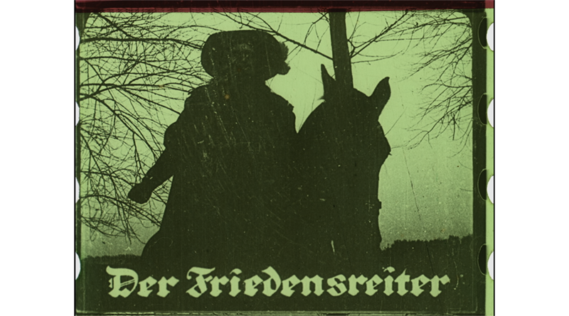 | 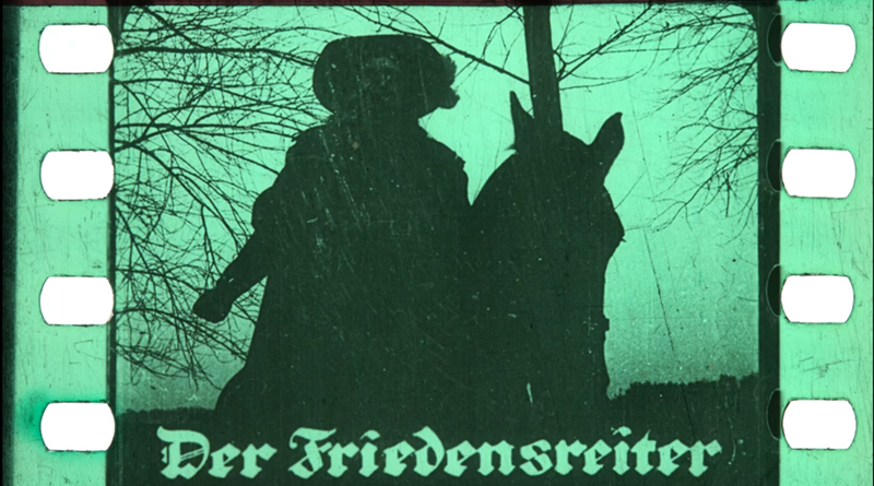 | 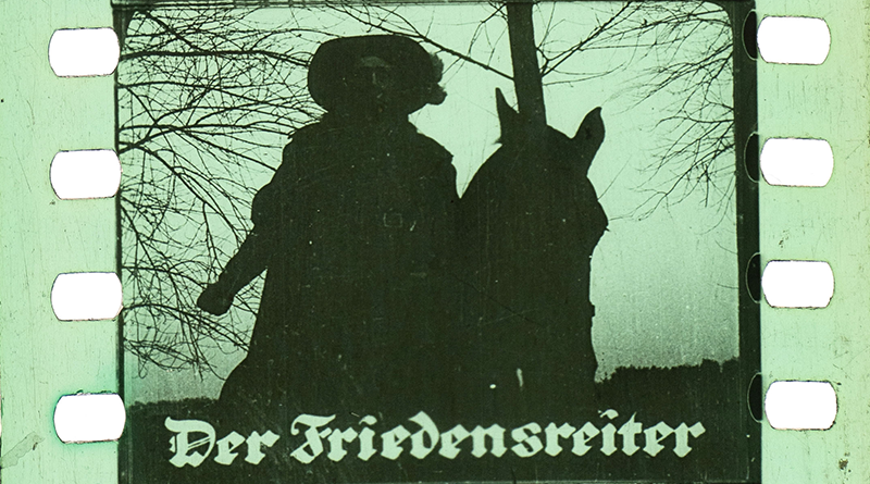 |
| Green 2 |  |  |  |
| Yellow 1 | 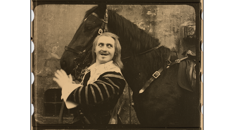 | 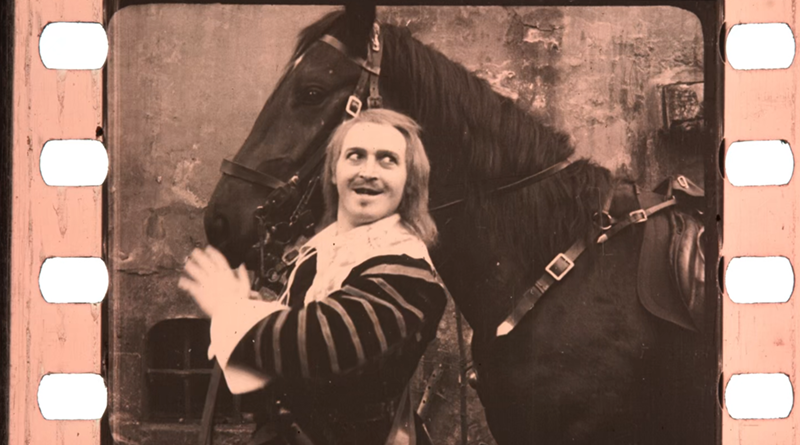 | 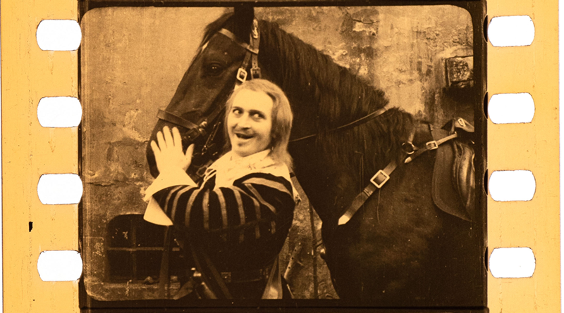 |
| Yellow 2 | 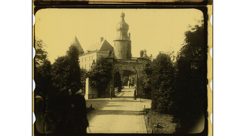 | 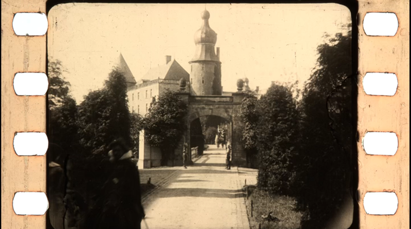 | 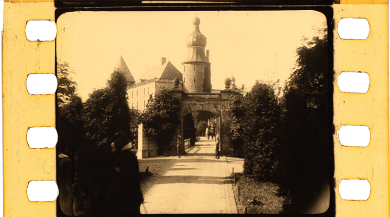 |
| Red 1 | 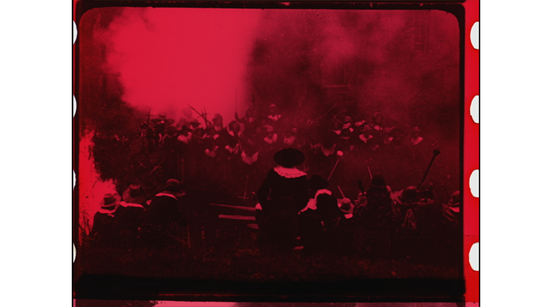 | 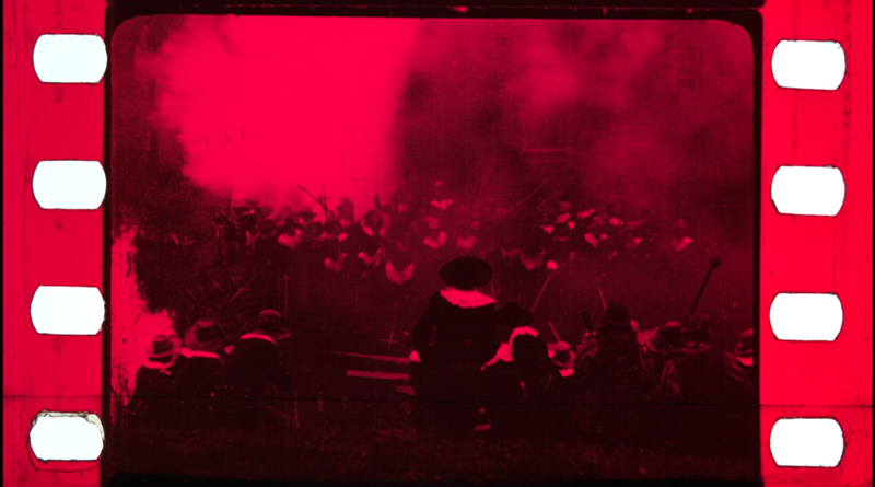 | 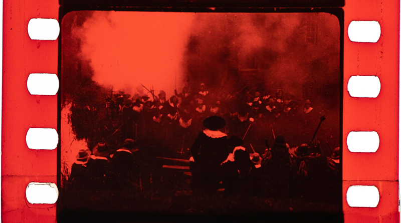 |
| Red 2 | 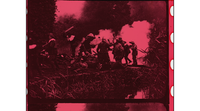 | 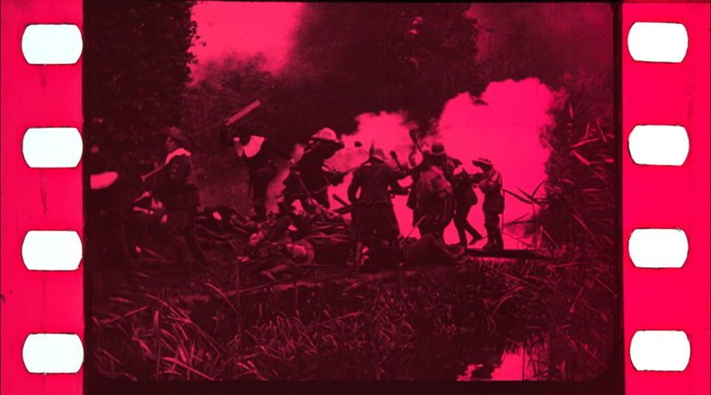 | 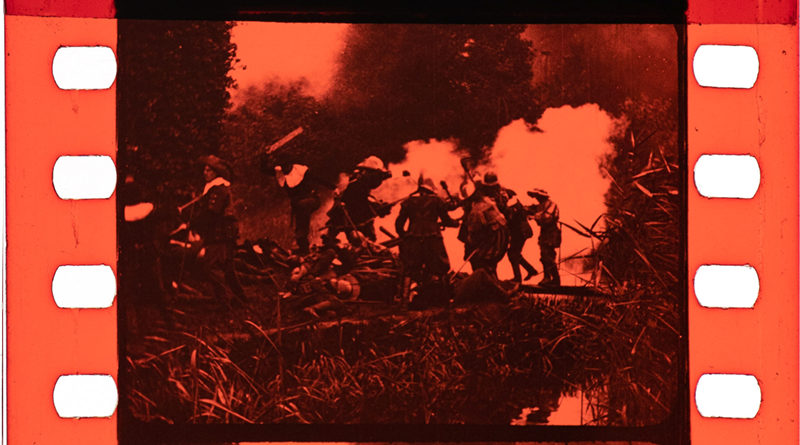 |
| Coral | 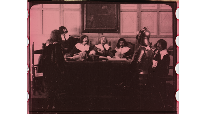 | 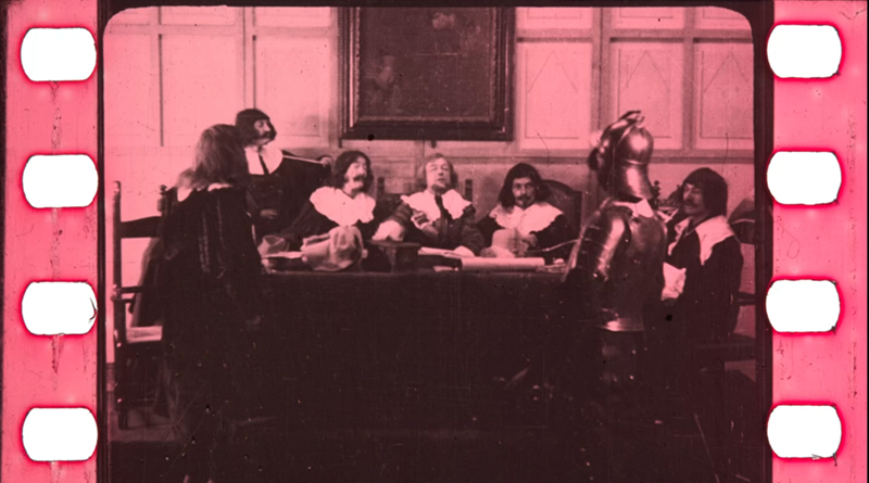 | 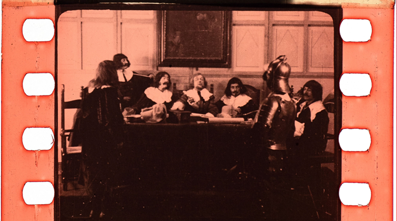 |
| Aquamarine/Cyan | 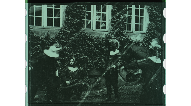 | 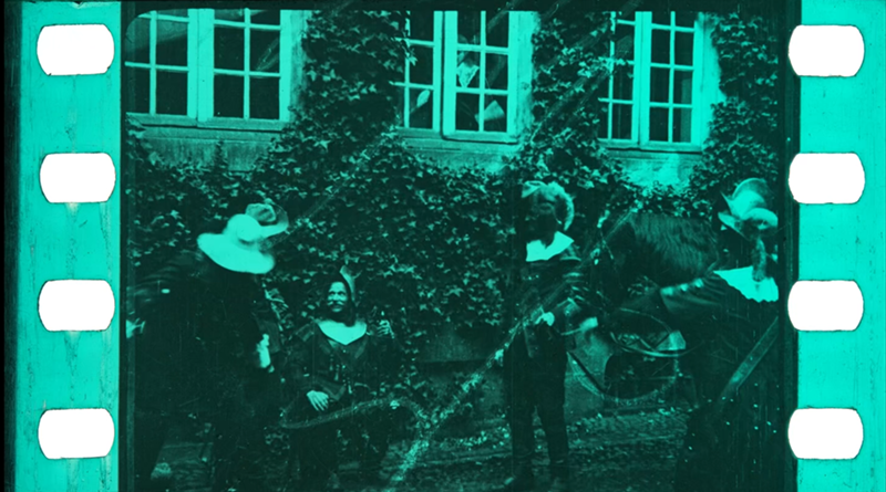 | 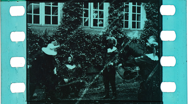 |
| Black/white |  |  |  |
Grading?
With the reference images made, how do we grade it? It’s a different topic, but I’ve never managed to decide on which grading approach give the best results and is the most practical:
- Grading the scans as colour film
- Desaturating the scans and creating the colours from scratch.
Considering how the Scanity captured some of these tints, getting to a good end-result might require going for the second approach.
If the second approach is the most practical in most cases, an option would be to scan such films using the monochrome HDR mode of the Scanity. That would allow me to capture a wider density range, but all colours would have to be recreated from scratch.
Even though the colours don’t look right, I believe scanning the film in colour still has merit. It lets you document the fact that there were colours (although rendered incorrectly) in the film, something a monochrome scan would not. As long as you are dealing with colours your scanner can see, that is…
This text is based on various tests and work I did in 2022.
Fluckiger et al. (2018). Investigation of Film Material–Scanner Interaction. Fluckiger. (n.d.). Investigation of film material–scanner interaction. Retrieved March 9, 2023, from https://barbaraflueckiger.files.wordpress.com/2018/03/flueckigeretal_investigationfilmmaterialscannerinteraction_2018_v_1-1c.pdf ↩︎
Trumpy, Giorgio & Flueckiger, Barbara. (2018). Chromatic Callier Effect and its Repercussions on the Digitization of Early Film Colors. Journal of Imaging Science and Technology. 63. 10.2352/J.ImagingSci.Technol.2019.63.1.010506. ↩︎